Duis mollis est non commodo luctu, nisi erat porttitor ligula, eget lacinia odio sem nec elit. Nullam quis risus eget urna mollis ornare vel. Nulla vitae elit libero, a pharetra augue. Praesent commodo cursus magna vel scelerisque nisl consectetur et.
Simple Carousel

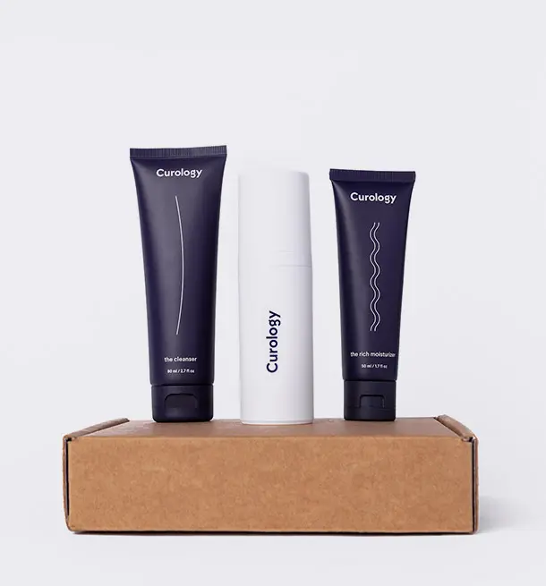
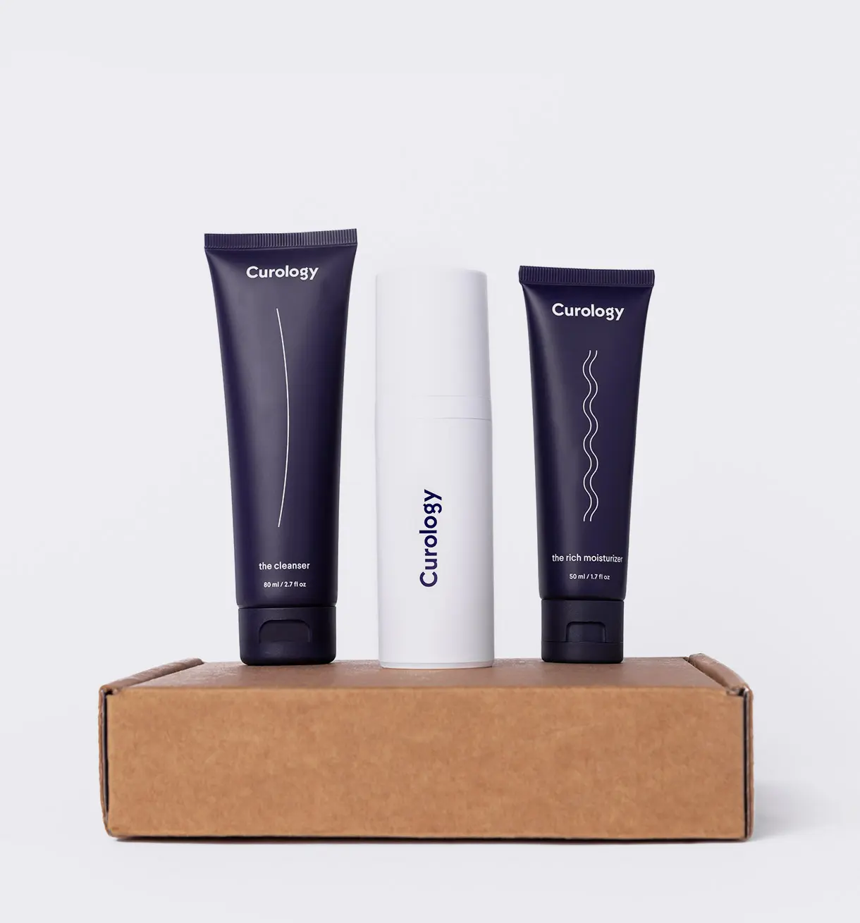
Read More

Read More

Read More

Read More

Read More
Card Carousel
Text Slider
Image Slider
Remove .dots-over class to move bullets below the images.
Use any available .m-*, .p-*, .bg-* and .text-* helper class to style and place the captions. You can change their placement with the help of flex classes as well.
Use animate.css animation and utility classes to add animations and delays to captions.
For hero slider (slider with fixed height and background cover images) with captions example check out Demo 15


Thumbnail Slider


Instructions
Data Attributes
Specifically created for the template to be used on HTML. Apply any attribute to .swiper-container to set swiper options.
| Attribute | Default | Options | Description |
|---|---|---|---|
data-effect |
slide | slide | fade | Slide transition effect. |
data-items |
3 | number | Number of items per view in all devices. |
data-items-xs |
1 | number | Number of items on screen width 0 - 575px |
data-items-sm |
items-xs | number | Number of items on screen width 576px - 767px |
data-items-md |
items-sm | number | Number of items on screen width 768px - 991px |
data-items-lg |
items-md | number | Number of items on screen width 992px - 1199px |
data-items-xl |
items-lg | number | Number of items on screen width 1200px - 1400px |
data-items-xxl |
items-xl | number | Number of items on screen width 1400px and above |
data-speed |
500 | number | Duration of transition between slides (in ms). |
data-autoplay |
false | true | false | Enable/disable autoplay. |
data-autoplaytime |
5000 | number | Delay between transitions (in ms). If you need to specify different delay for specific slides you can do it by using |
data-autoheight |
false | true | false | Set to true and slider wrapper will adapt its height to the height of the currently active slide. |
data-margin |
30 | number | Distance between slides in px. |
data-loop |
false | true | false | Set to true to enable continuous loop mode. |
data-nav |
false | true | false | Enable/disable navigation arrows. |
data-dots |
false | true | false | Enable/disable pagination bullets. |
data-drag |
false | true | false | Enable/disable moving with touch. |
data-reverse |
false | true | false | Enables autoplay in reverse direction |
data-updateresize |
true | true | false | Swiper will recalculate slides position on window resize (orientationchange) |
Alternative styles for controls
Use the following classes with .swiper-container to change navigation styles.
| Class | Description |
|---|---|
.swiper-hero |
Enables hero slider, ie: Demo 15 |
.swiper-fullscreen |
Enables fullscreen slider, ie: Demo 23 |
.nav-dark |
Changes arrow background to dark color. |
.nav-color |
Changes arrow background to primary color. |
.nav-bottom |
Moves arrows below the slider. |
.nav-start |
Moves arrows from center to left. Requires .nav-bottom |
.dots-light |
Changes bullet colors to white. |
.dots-start |
Moves bullets from center to left. |
.dots-over |
Moves bullets on the slider. |
.dots-closer |
Moves bullets closer below the slider. |